At Doran’s Lab, one of our goals is to use data to translate League of Legends concepts into things we can measure with numbers. In this article we will grapple with a commonly used but insufficiently mathematized concept—map movement.
If you watch enough LCS, you may hear a caster say a team’s win was the result of “superior map movement.” That’s a pretty nebulous claim, but what we think they are trying to get at when they say something like this is: “Which team had their champions where they needed to be more often than the other team?” That’s a hard question to answer (and we’ll leave it to the casters to make their assessments for now), but we’d like to break that question down into components we can actually calculate.
Certain types of map movement in League are easy to describe and play an important strategic role in the game. Depending on what champion they’re playing, a player might decide to distance themself from the team, stick with a partner, or rotate to another lane. Because we get position data on every champion, we can construct metrics which describe these behaviors based on many games, then look at overall trends. Here’s what we came up with:
- Split score: A measure of how far away a player is from all allied champions between minutes 15 and 30.
- Companion score: A measure of how close a player is to the nearest allied champion between minutes 5 and 20.
- Rotation score: A measure of how much a player rotated around the map between minutes 5 and 20.
Before going any further, it’s important to point out a few things about the tracking of player location. The location of a player is their (x, y) coordinate on the map. Summoner’s Rift is a 16,000 x 16,000 map so that a player in the exact center of Summoner’s Rift is at (8000, 8000), while the bottom left and top right corners of the map are (0, 0) and (16000, 16000), respectively.
We only receive player positions once per minute, meaning that for a 30-minute match we have the locations of each player at the start of the match (minute zero), and then at minute one, minute two, and so on. This means that something like a support roaming into enemy jungle to place a ward and immediately coming back to lane may not be observed.
Explanations of Metrics
Split Score
Split score is our way of measuring how far away a player is from their teammates, with the intention of capturing differences in strategy like whether someone is prioritizing split pushing and solo farming or sticking with their team. The calculation of split score is straightforward: We measure how far a player is from the rest of their team, on average, during minutes 15-30 of the match. To get this measure of distance, the typical distance formula can be applied.
We chose to limit our calculation to minutes 15-30 because we’d like to capture player movement in the mid and late game, when the laning phase has mostly ended. We figured that because it is common for players to spend most of their time in lane during the early phase of the game, measuring the distance to teammates during that time would not lead to significant insights. By looking only at the mid-late game, we are able to differentiate top laners who prefer teamfights to those who prefer to split push.
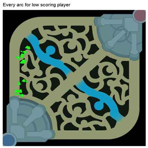
Below we see a player (the red square) at minute 21 of the match, along with their four teammates. If we calculate the distance from the player to each teammate and average them up, we find that this player’s split score at minute 21 was 8042.
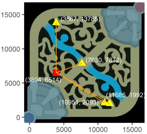
Diagram showing the distance to all teammates (yellow triangles) for a particular player (red square) at minute 21 of the match. The average length of the orange lines is a measure of how close the player was to their teammates at this minute. Averaging that value for minutes 15 to 30 gives us the player’s split score.
For each metric, we’ll provide examples of actual players who earned high and low scores. In the following examples, we have a player who had a high split score (on the left) and a player with a low split score (on the right). The scores seem to match our intuitions around splitting, as the player on the left was often found split from their team, while the other player was usually grouped closely with their team.
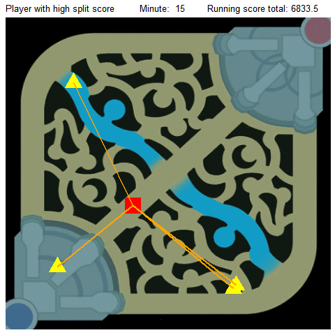
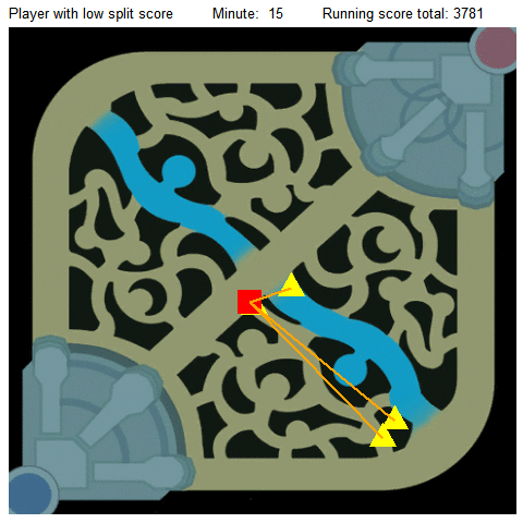
Gifs showing the distances from particular players (red squares) to their teammates (yellow triangles) during minutes 15-30 of the match. The player on the left earned a high split score, while the player on the right earned a low split score.
Companion Score
Now that we have a way to measure how far a player is from their team as a whole, we’d like to have a way to tell if that player is truly on their own, or close to a friend. For the two players in a 3-2 split push, or simply a bot lane carry and support duo, it might be the case that the two players are sticking close together, even though their split score indicates that they are far from their teammates on average. To account for this, we came up with the companion score.
Like with split score, the calculation for companion score is straightforward: Each minute, we find the distance between a player and their closest teammate. We average those numbers for minutes 5-20 and call this the player’s companion score. So,
high companion score = worse companion, while
low companion score = better companion.
We used minutes 5-20 because we’d like our metric to capture player behavior in the early game. For instance, we can identify whether a top lane player prefers to roll solo or engage in team fights. We can also look bot lane to measure the tendencies of the support and bot carry; Are some supports less supportive of the bot carry than others? Which bot carry needs the most oversight? These are the types of questions we believe companion score can help answer.
For example, in the image below, we can see a player (the red square) is at location (4600, 9441) and their closest teammate is at location (7074, 7054). We call that closest teammate their companion. Just like with split score, we can use the distance formula to determine how far the player is to their closest companion. Plugging the locations of the two players into the formula gives us a value of 3438, telling us that the players are about 3438 units apart.
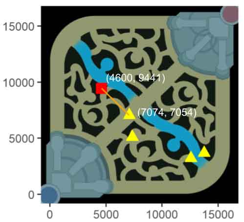
Diagram showing the distance from a particular player (red square) to their nearest teammate (yellow triangle connected by orange line). Companion score is the average distance of these orange lines during minutes 5-20 of the match.
Repeating this for game minutes 5-20 (different companions can be assigned at each time point) and averaging over the values results in the player’s companion score. Below, we’ve included examples of high- and low-scoring players along with a snapshot of the lines showing the distance between the player of interest and their closest teammate at each minute. Since companion score is the average of these distances, the score for these players is the average length of the orange lines.
The player who received a high companion score is on top and the one with a low companion score is on the bottom. Note, a player with a low companion score would be one that stuck with their teammates (though not necessarily the same teammate) quite a bit during the early and mid game, and a plot showing the distances to their companion will contain shorter orange lines (like we see in the second example). Meanwhile, a player with a high companion score would be mostly on their own and have a plot full of longer orange lines (like we see in the first example).
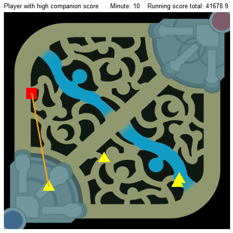
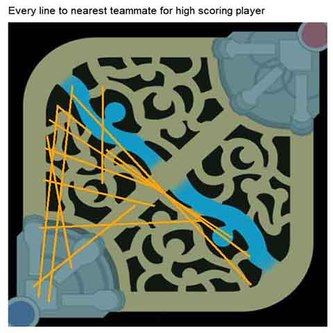
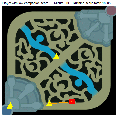
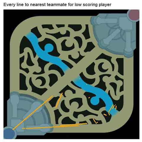
Gifs showing the distances from particular players (red squares) to their nearest teammates (yellow triangles) during minutes 5-20 of the match. The top player earned a high companion score, while the bottom player earned a low companion score. To the right of each gif is a plot showing the distances to companion each player accumulated.
Rotation Score
The last component of map movement we’d like to address is map rotation, which was a fun challenge to think through. When people talk about rotation in League, they are usually describing movement that involves switching lanes and changing between the bottom and top side of the map. A key realization here is that in League, some types of movement are more important than others. For example, even though the distance from bot to mid is the same as the distance from base to mid, movement from bot lane to mid lane could represent an aggressive roam from the bot lane, whereas movement from base to mid lane could simply be a mid laner sticking to their lane. Our goal was to come up with a rotation score that captured important map movement, while ignoring the insignificant stuff.
Before we go into our final version of rotation score, we’d like to discuss some other ideas we had first, to give a sense of our thought process in creating these metrics.
Our first approach was to sum up the distances between a player’s location at minutes t and t + 1 and divide by the number of minutes in the match; that is, to measure how far a player moved on average during the match. The problem with this approach is that it was heavily influenced by unimportant map movement. When just looking at how far a player moved without specifying where they were moving, there was no distinction between running from base to lane and running from one lane to another.
We also tried taking the sum of all angles created from positions at minute t and t + 1 and dividing by game length, resulting in the average amount of literal “rotation” a player had every minute. (A peek at the next graphic shows that the angle created by this player’s movement was equal to 38.5°. We’ll get back to this graphic shortly.) However, this strategy runs into a problem as well. Namely, it’s easier to make large angular changes when at your own base than it is when you’re further out in lane. To visualize this, picture the orange lines in the next graphic being half as long as they are; the angle created by the player will still be 38.5°, but it now requires less distance to be traveled to create the angle. This version of rotation score was inadvertently awarding higher marks to players who happened to be closer to their own base.
Our solution involves a compromise of our two previously unsuccessful attempts. Because we care about angular movement, but also need to account for distance from base, we incorporated both of these things in our new calculation.
To help visualize an application of how our rotation score is found, the image below shows the location of a player at minute 13 of the match (hollow square) and then at minute 14 (solid square). The green arc represents this player’s rotation score for these two minutes.
You can calculate the length of the green arc as follows: first, find the distances of the two lines connecting the corner of the map next to the player’s base (location (0, 0)) to points denoting the player’s location at times t (4910, 4619) and t + 1 (1754, 12130). Then, average these two distances and multiply this number by the angle formed from the three points, in radians; here, 38.5° is equal to .67 radians. This multiplication of a radius (like our average line distance) by an angle actually gives us the arc length (you can prove this for yourself using a few basic equations for circles, or look it up). Here, we’re finding the length of the arc along a circle with radius 9498.7 and a central angle of 38.5°. A useful tool for visualizing how arc length works can be found here.
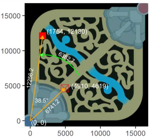
Diagram showing the arc created by a player’s change in position from minute 13 (hollow square) to minute 14 (solid square). Rotation score is the average length of these arcs during minutes 5-20 of the match.
The overall rotation score for the player in the match is then found by averaging all the arcs formed during minutes 5-20 of the match.
We chose to limit rotation score to minutes 5-20 based on the assumption that this early phase of the game is when most lane swaps and roaming happens, and when those tactics are most strategically relevant. Our concern was that if we included later time points, our metrics might become biased by games where towers went down early and entire teams were moving around together, which is not what we are trying to measure.
As with the previous two metrics, we’ve included examples of players who earned high and low scores in the metric; seen below, the top example is a player who earned a high rotation score, while the bottom example shows a player who earned a low score. To the right of each example is a snapshot of the arcs the player accumulated during minutes 5-20 of their match.
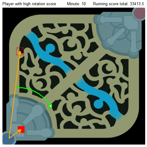
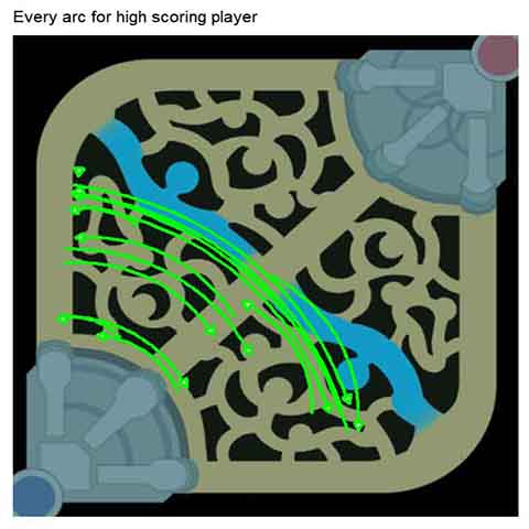
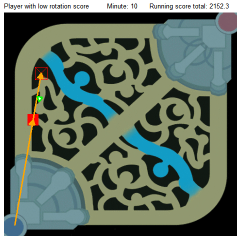
Gifs showing the arcs created by changes in position from the previous minute (hollow square) to the current minute (solid square). The top player earned a high rotation score, while the bottom player earned a low rotation score. To the right of each gif is a snapshot of the arcs created by the player during minutes 5-20 of the match.
To achieve a high rotation score, a player will not only need to create large angle changes, but also do so away from their own base. The first player certainly does this, so our system awards them a high rotation score. The second player, however, never changes lanes and so doesn’t create any large angle changes; hence, the two players score quite differently according to our metric.
Relationship Between Metrics and Win %
Our next step was to evaluate the relationship between the metrics and the outcome of games. In the following tables, each quartile contains 25% of teams; this means that 25% of teams had an average rotation score between 573 and 1969, 25% scored between 1970 and 2210, etc. The rest of the first table can be interpreted like this: Of the teams whose five players averaged a rotation score between 573 and 1969, only 43% of them won. Meanwhile, of teams whose players averaged a rotation score in the 4th quartile, 56% of them managed to win.
| Quartile | Rotation score range | Win % |
|---|---|---|
| 1st | 573-1969 | 43% |
| 2nd | 1970-2210 | 49% |
| 3rd | 2211-2474 | 52% |
| 4th | 2475-4386 | 56% |
The companion and split score tables can be interpreted in the same manner.
| Quartile | Companion score range | Win % |
|---|---|---|
| 1st | 657-1658 | 44% |
| 2nd | 1659-1803 | 48% |
| 3rd | 1804-1953 | 51% |
| 4th | 1954-3383 | 56% |
| Quartile | Split score range | Win % |
|---|---|---|
| 1st | 2036-4681 | 38% |
| 2nd | 4683-5096 | 47% |
| 3rd | 5097-5526 | 54% |
| 4th | 5527-9168 | 60% |
These results make sense intuitively. When players are losing lane, they lose control over the minion waves, and generally this leads to large swarms of minions gathering at their turret. This allows opposing players the freedom to either roam for kills or to place deep wards, further stifling movement. Add in the threat of a fed Evelynn or Hecarim, and it becomes clear why losing teams don’t rotate as well as winning ones.
It may seem contradictory that as teams have higher companion scores, they have a higher win rate. First, let’s examine the bottom end of the metric. When teams have multiple losing lanes or are just losing the game in general, they’re usually at a turret disadvantage; this means that less of the map is safe. Given a constraint on the total amount of area a team can move around in, it seems reasonable to expect lower companion scores in this situation. At the opposite end of the metric, a different effect occurs: When a team is winning, a player has more options available to them depending on their role. Junglers can power farm without having to help losing lanes, mid laners can be isolated in a separate lane at less risk to themselves, and top laners can split push reliably with appropriate pressure in a different area of the map. These combined factors can lead to the increased distance between teammates, while also being acceptable strategies for victory.
At a glance, split scores seem to function similarly to companion scores. Splitting off from one’s team becomes a dangerous option when on the losing end of a match. Threats like uneven teamfights, multi-person ambushes, or Rengar become much more relevant when a team isn’t around for assistance. As a result, we would guess that losing teams tend to bunch together, thus lowering overall split score, at least until a potential comeback late in the game. Conversely, a winning team with a fed Fiora can easily split push, dominate anyone who dares oppose him, and absorb large amounts of pressure so their team can easily contest and force objectives.
To illustrate why this is useful, let’s move from the Rift to the baseball diamond, for an example from another competitive game. Colloquial wisdom says that the goal for the batter should be to hit the ball very, very hard. This isn’t exactly profound, but general intuition always supported it. Until recently, this insight was stuck in the realm of the the unquantifiable; however, we now have the technology to measure precisely how hard a ball was hit. After digging through the data, baseball analysts confirmed that indeed, hitting the ball hard (at the right angle) generally leads to good results.
Herein lies the power of data. Before, all we had was: “Hitting the ball harder is better.” Now, we have knowledge such as: “For every mile per hour harder you hit the ball, you can expect your results to be __% better.”
Our new metrics serve a similar function. Though playing the game teaches you that a losing team is usually less mobile and forced to be huddled together, we can now begin to quantify the effects. Instead of “nobody rotating/able to rotate = bad”, we can now say something like “You’re only going to win about 43% of games in which your team isn’t able to rotate enough to achieve a rotation score of 1969 or greater.”
Leaderboards
Now that you know how the metrics are calculated and their relation to win rate, the next step is to examine the scores on a champion-by-champion basis. Displayed below is a table showing the average scores earned by champions during matches in the 8.14 patch from a month ago.
The raw data for this table can be accessed in .csv format here.
As can be expected, junglers top the rotation score leaderboard. Not only that, but aggressive junglers like Evelynn and Rengar top the entire list, having higher scores than tank junglers like Zac or Sejuani. This makes sense because assassin or carry junglers need to have productive early games and multiple ganks to be relevant later in the game, whereas tank junglers will be inherently useful by acting as a frontline for their team, regardless of how much they get around the map. Additionally, AD carries and other bot lane carries have the lowest rotation scores, which is to be expected since they spend a lot of time farming in the bot lane. Many mid laners also have low rotation scores, potentially due to the less potent roaming powers of many of those champions. Aurelion Sol may be able to fly over walls, but Viktor hasn’t quite figured out how to make his Hex Core do that yet. While it might seem reasonable to expect top laners to score as low as mid laners, we presume that the use of Teleport and semi-global ultimates give them a slight edge.
Unsurprisingly, the companion scores showed that supports and the champions they support tended to have the lowest companion scores due to laning with each other in close proximity. On the opposite side of the map, it makes sense that top laners have higher companion scores on average, giving credence behind the “top lane is an island” mentality. For example, Nasus managed to have a companion score almost 1000 points higher than Miss Fortune in Diamond ranked games. Junglers have similarly high companion scores, most likely because of their jungle pathing and generally solo activities for the majority of the early game. Interestingly, there appears to be little variability in companion score between all junglers. Whether this is a product of random chance or this suggests something about all junglers is uncertain; however one explanation could be that junglers tend to gravitate on average towards the same jungle paths early game.
Since one of the main goals of split score was to see the split push tendencies of various top laners, it was no shock that many top laners dominated the split score leaderboard. Classic split push duelists like Fiora and Jax were towards the top, right above other similarly-skilled champions like Nasus and Illaoi. Even tanks that look to primarily force team fights with intelligent Teleports like Maokai had above average split scores. However, this contrast between top laners and the rest of the team lessened in lower ranks, suggesting that lower ranked top laners tend to favor grouping up more often, either by choice or lack of game knowledge.
Lastly, we’d like to thank our analyst Andy Huang for providing valuable insights into the relationship between our metrics and win rate, and into the metric leaderboards.

Join in on the fun!
At Doran's Lab, we strive to keep our process transparent and accessible. We've included the data corresponding to this article in a public Github repository for you to download and use. The data used for this article is the same as the data used for the article on champion clustering.