Understanding Champion Similarity: Part I

Matthew S. — August 21, 2018

In 2016, Riot Games made a post on their Dev Blog which grouped champions into classes and subclasses. By thinking carefully about the strengths and weaknesses of each champion as well as the state of the metagame, Riot was able to form useful categories of champions according to their playstyles and roles within a team. While Riot may have analyzed their own internal game data to help create these groups, we’re guessing that their final decisions were based mostly on the intuition of their developers and playtesters. This raises the question: in what sense do Riot’s groupings capture meaningful differences between champions, rather than the subjective opinions of the people that made them?


To get insight into this, we tried approaching the problem from a primarily data-driven perspective. We grouped champions using a statistical algorithm that groups together champions which are most similar to each other, where similarity is computed using measurable champion attributes. By using this algorithm, we limited the use of human intuition so that it had less of an impact on our final results. The hope is that by doing this, our results are more “objective,” in the sense that they depend more on the the data than on our opinions. This is useful because it can help identify similarities between champions that do not appear to be similar at first glance, and it also allows us to quickly rerun our clustering (grouping) at any time to recalibrate the grouping to reflect changes in champion ability or playing styles. It’s important to note, however, that this doesn’t mean our method is better: maybe our method is great for answering some questions, whereas Riot’s is better for others. In any case, we have some cool results and we hope that you will be able to glean some insights from them! If you’re an employee at Riot who works on creating classes of champions, maybe it will give you a new idea or help settle a disagreement with that colleague who is convinced that Mundo is a fighter, not a tank.


Asking the Right Question

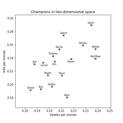
Now that we know the type of question we want to answer (which champions are like each other?), we need to express this question in a way that math and statistics can help us answer. Here is how we formulated the question: if we have (i) a list of champions, (ii) a pre-specified number of groups (for example, “three groups”), and (iii) data relating to each of the champions, how can we assign each champion to exactly one group such that champions with similar data tend to be placed in the same group? In the field of machine learning and statistics, this type of problem is known as a clustering problem. Here, “clustering” refers to the process of assigning champions to different groups, aka clusters, using of each champion’s data.


Number of Groups

Champion clustering by role and number of clusters


The graphs above are the end result of our champion clustering and can be filtered by lane and the number of groups champions were sorted into. The TL;DR explanation is: similar champions are close to each other, dissimilar champions are far away from each other, and colors show groups of champions that are similar overall. Now, none of this is very useful unless you know what data were used to determine champion similarity. So, here it is: the only thing the grouping algorithm got to use was the average of each of the following variables for each champion.


  • Kills per minute: The number of kills a champion gets in a game per minute.
  • Deaths per minute: The number of times a champion dies in a game per minute.
  • Assists per minute: The number of assists a champion gets in a game per minute.
  • Total damage per minute: The total amount of damage a champion deals in a game per minute.
  • Percent magic damage: The percentage of magic damage a champion deals compared to total damage dealt.
  • Percent damage mitigated: The percent of damage taken compared to the damage received (damage is mitigated by shields, armor/magic resistance, and damage reduction abilities).
  • Objective damage per minute: The total amount of damage dealt to objectives (structures, dragons, Baron Nashor, and Rift Herald) per minute.
  • Total healed per minute: The total amount of healing done by a champion per minute.
  • Crowd control score per minute: The total time spent crowd controlling (CCing) others in seconds per minute. Slows are weighted by 16, soft CC is weighted by 12 and hard CC is weighted by 1.
  • Split score: The average Euclidean (straight-line) distance to all allied champions between minutes 15 and 30.
  • Companion score: The average Euclidean distance to the nearest allied champion between minutes five and 20.
  • Rotation score: The average minute-to-minute change in arc length relative to the champion’s angle to their fountain between minutes five and 20. (Want to know more? See our article on champion location metrics!)


But What Does It Mean?

You might be wondering: what do the x-axis and y-axis represent in the plots above? That’s a great question, but before we get there, let’s take a brief moment to think about a simpler case. Imagine we only used two variables for each champion: kills per minute and deaths per minute. We could plot those together on a graph, using the x-axis and y-axis. In that case, you could think about each champion as a point in two-dimensional space, where one coordinate represents the kills per minute and the other coordinate represents deaths per minute.


Kill/death graph, ADC

Champions as points in two-dimensions: deaths per minute (X) and kills per minute (Y). (We show traditional marksmen only, to keep the plot from being too cluttered. Miss Fortune overlapped with Tristana so closely that we removed here, for visual clarity.) Here’s a cool way Riot represented champions in two dimensions.


For example, Ashe is represented by the point (0.22, 0.18) because she has 0.22 deaths per minute and 0.18 kills per minute. By looking at this plot, you can tell whether two champions are similar (according to their kills and deaths) by simply looking at how close the points for the champions were.


Okay, great—now we have a way to see how similar champions are by representing them in two-dimensional space. However, we realize there’s a lot more to champions than kills and deaths. We need to add things like damage, crowd control, and other important variables! So, can we extend the example from above to include more than two variables? The answer is yes, but we’re going to need more advanced math to do it! (Don’t worry—you can understand the gist of everything we did without knowing the specifics.)


When we had two variables for each champion, we thought of champions as points in two-dimensional space. Now that we have 12 variables for each champion, it makes sense to think of champions as points in 12-dimensional space! The problem is, we live in a three-dimensional world and thinking about higher dimensions is really hard. It’s easy to say “a champion is a point in 12-dimensional space,” but even 200 IQ Pobelter won’t be able to derive any meaning from that alone. We need to convert this larger space back to two-dimensional space, something we can intuitively understand.


What you see in the interactive plot above is exactly that: it’s a two-dimensional representation of the 12-dimensional space formed by the 12 variables shown above. The computer did this using an algorithm called t-Distributed Stochastic Neighbor Embedding (t-SNE). This sounds complicated, but you can just think of it as putting champions with similar values of the 12 variables close to each other and champions with dissimilar values far away from each other. If you want to get into the technical details, this page has a nice explanation. The conclusion to our initial question (what do x and y mean?) is that the x-axis and y-axis have lost any obvious meaning (there’s no simple formula like x = kills per minute * deaths per minute), but that the x and y values were chosen by algorithm to give the “best” representation of the similarities and dissimilarities of each champion, according to all 12 variables.


Interpreting the Results

Taking a look at the jungle-6 grouping, you can see that most AP junglers are blue, tanks are green, off-tanks are yellow, bruisers are black, AD assassins are purple and split pushers/surprise gankers are red. Within these groupings there are some interesting outliers. For example, Fiddlesticks is grouped with the tanks instead of AP junglers. We think this is indicative of his heavy CC and inability to reliably deal damage. It is also interesting to see that the algorithm grouped Kindred and Quinn with Rengar instead of Graves and the other bruisers. In this case, our clustering algorithm isn't asserting that Kindred and Quinn are closer to Rengar than Graves, just that they are more similar to the group of champions which Rengar is in compared to the group of champions that Graves is in.


In the jungle-6 grouping, Nocturne is grouped with the bruisers. This is where we think Nocturne should be; however, when we initially did the groupings he was grouped with the tanks. We later found out this was because he had a extremely high CC score, one that was more than two times greater than any other champion. This is because the game treats the darkness from Nocturne’s ult as a hard CC which is applied to every enemy champ for the duration. To give this perspective, this means that every time Nocturne ults he CCs every living enemy for six seconds, totaling to a maximum of 30 seconds of total CC. This is the same as Malzahar ulting 12 times, Amumu getting three five man ults, or 20 single target Malphite ults. As you might expect, we thought this was ridiculous. Therefore, we manually went into the dataset and edited Nocturne’s CC score to be the average of all other CC scores. This allows for Nocturne’s grouping to be based more on variables other than CC score, rather than being determined mostly by his extreme CC score. We think this was a reasonable decision, but it’s a good example of why our method isn’t completely “objective” as even though we used a statistical algorithm, we had to make subjective decisions about which variables to include, and how to include them, in order to get our results. This is true of any statistical analysis and is good to keep in mind.


Data Collection and Position Assignment

For our analysis we looked at about 450,000 ranked solo queue games from patch 8.14. To make sure our games were representative of a typical 5v5 game, we eliminated games which had an AFK player or no jungler. We defined AFK games as ones where a player stood in the same place for three minutes, and games with no jungler as ones where a team did not kill a single jungle minion by six minutes. We were concerned that players in these games would act differently and possibly affect our clustering; a team with an AFK may just allow the opposing team to push down mid and subsequently fall far behind in all their statistics like kills, gold, etc. This would lower their champions’ average statistics and would be especially problematic to champions with few games played.


We also split up our champions by the lanes or positions which the champion played in the game (top, mid, jungle, bot, support). This allows us to separate the different playstyles a champion may assume when playing in different roles. For example, we know that support Shen and top Shen play very differently, so by splitting by position we can ask specifically if top Shen is more like Gnar or Nasus or if support Shen is more like Leona or Lulu. The positions were assigned by using the following rules:


  1. The jungler is the player with the most jungle minions killed by six minutes.
  2. The support is the player with the least minion kills.
  3. The top laner is the player with the highest position (y-coordinate).
  4. The mid laner is the player with the next highest position (y-coordinate).
  5. The bot laner is the only remaining player on the team.

These rules were made based on a modification of the algorithm given on the last page of this paper. While this method is not perfect, we checked a lot of games, and this method seemed to do very well at identifying the role of each player.


Data Preparation

When starting any data analysis, it’s important to think about what data is relevant to the problem. For this project, we looked through Riot’s API data and picked variables that we thought were most relevant for measuring the characteristics of different champions. After grouping our wanted variables we realized where were many factors we had to account for in those statistics in order for our groupings to be meaningful. For example, many of the statistics we measured naturally increase as game time increases. For this reason, a champion that gets lots of kills per minute but has short games may actually have fewer average kills per game than a champion that has long games. To account for the effect of game length, we divided most of our statistics by game length (for example, using kills/minute instead of kills).


Our next step in preparation for the clustering algorithm was the normalization of our data, which is a simple way of making it so we can compare numbers that correspond to totally different things. To get a sense of why that’s important, think about trying to measure champion similarity using gold earned and kills per minute. Gold earned is usually a large number, in the 1000s, but kills per minute is usually less than one. If we tried to compare these without modifying the values at all, differences in gold earned would outweigh differences in kills per minute, even though it might be the case that a 1000 gold difference in gold earned isn’t nearly as big of a deal as a difference of 0.5 kills per minute.


To correct for this difference all we had to do was modify the value of each variable by subtracting the overall mean for that variable and then dividing by the standard deviation (a measure of variability). In the figure below you can see how we transform the distribution of gold and kills into distributions which can be numerically compared. Notice how the shape of these distributions stay the same and only the numbers change; this is important as it means that we are not losing or distorting our information in any meaningful way.


Before-and-after normalization histograms for kills and gold earned

The above four graphs show the distributions of the kills and gold earned statistics before and after they are normalized. The normalized graphs maintain the original shape of their parent graph, the only thing that changes is the range of the normalized graphs. Both normalized graphs have a value of zero at their mean and have the same units, thus allowing them to be easily compared.


After normalization, average statistics were computed for each champion in each role. For each role, champions were eliminated if they did not appear in more than 0.5% of games in that position. This makes sure that we have enough games to make reasonable conclusions for all eligible champions.


Assigning Champions to Groups with an Algorithm

We talked earlier about the need to convert our 12-dimensional space of champions into a two-dimensional one. With the t-SNE algorithm, we are able to do exactly that, representing each champion as a point (x,y). This let us plot the new champion coordinates on a two-dimensional graph. Once the champions are represented in two dimensions, we are then able to use a another algorithm to assign them to groups. This is our “clustering algorithm.” The type of algorithm we use is called hierarchical clustering, and goes as follows:


  1. First create an initial set of clusters by making every point its own cluster, then
  2. Look across all current clusters, and find two clusters which are the most similar. (Technically: pick the pair which, when combined, will minimizes the total in-cluster variance across all clusters.)
  3. Combine the two clusters which you found to be the most similar.
  4. Repeat steps 2 and 3 until your desired number of clusters is obtained.

We used Python libraries to implement these algorithms for us in Python, which gave us the data for the interactive plot at the start of the article.


Closing Thoughts, and What’s Next!

Even if you didn’t follow all the technical details, we hope that you all will be able to glean some insights out of these groupings—maybe they can help you find the next champion you want to play or figure out who to play if your favorite champion is banned. These groupings may also be able to help us evaluate Riot’s champion classes; for example, we think that when played in the jungle Dr. Mundo shouldn't be seen as a tank as our method groups him with other fighter champs like Trundle and Warwick. However, we think that Dr. Mundo should be considered a tank when played top lane as he is grouped with the other tanks, and that this difference is due to the itemization and income differences between a jungler and a top laner.


We think our algorithm did a good job identifying champions which play similarly to one another. However, we’re not totally happy with it, due to one significant limitation. Because all our numbers are based on averages for each champion, it is unable to distinguish between champions that have totally different play styles. For example, with our current method, if tank Ekko was still played frequently, then when all Ekko games are averaged, the combination of tank Ekko and AP Ekko games would cause him to look like neither of the two roles but a combination of the two. Thankfully, we know of a way to deal with this! In another post coming soon (TM), will group champions according to performance in individual games, instead of averages across many games. Be on the lookout for our next article, Understanding Champion Similarity: Part 2!


Taric
Join in on the fun!

At Doran's Lab, we strive to keep our process transparent and accessible. We've included the data corresponding to this article in a public Github repository for you to download and use.