Chapter 4 — Reshape and visualization

This chapter covers two additional concepts that will round out your foundation in programming for data analysis: changing the structure of data (reshaping) and creating plots to get a better look at data (visualization).
Reshaping data
Reshape commands change the structure of data without changing the data itself. One example of a reshape operation is pivot, which changes a table from a “long” to a “wide” format as shown below.
| matchDate | champion | count |
|---|---|---|
| 09-26 | Draven | 142 |
| 09-26 | Lucian | 519 |
| 09-26 | Jinx | 65 |
| 09-27 | Draven | 184 |
| 09-27 | Lucian | 695 |
| 09-27 | Jinx | 71 |
| 09-28 | Draven | 192 |
| 09-28 | Lucian | 713 |
| 09-28 | Jinx | 55 |
| 09-29 | Draven | 202 |
| 09-29 | Lucian | 811 |
| 09-29 | Jinx | 100 |
The original table (long)
| matchDate | Draven | Lucian | Jinx |
|---|---|---|---|
| 09-26 | 142 | 519 | 65 |
| 09-27 | 184 | 695 | 71 |
| 09-28 | 192 | 713 | 55 |
| 09-29 | 202 | 811 | 100 |
After the pivot operation (wide)
Can you tell why we call this a long-to-wide reshape? Notice that the data are the same in each table, but the original table is a (date, champion)-level table, whereas the resulting table is only a date-level table.
The code to perform the pivot operation is as follows:
The pivot operation takes three arguments:
ARGUMENT 1: Index
Unique values in this column become the index in the new table. There’s a row for each unique value in this variable.
| matchDate | champion | count |
|---|---|---|
| 09-26 | Draven | 142 |
| 09-26 | Lucian | 519 |
| 09-26 | Jinx | 65 |
| 09-27 | Draven | 184 |
| 09-27 | Lucian | 695 |
| 09-27 | Jinx | 71 |
| 09-28 | Draven | 192 |
| 09-28 | Lucian | 713 |
| 09-28 | Jinx | 55 |
| 09-29 | Draven | 202 |
| 09-29 | Lucian | 811 |
| 09-29 | Jinx | 100 |
| matchDate | Draven | Lucian | Jinx |
|---|---|---|---|
| 09-26 | 142 | 519 | 65 |
| 09-27 | 184 | 695 | 71 |
| 09-28 | 192 | 713 | 55 |
| 09-29 | 202 | 811 | 100 |
ARGUMENT 2: Columns
Columns of the new table are the unique values of this column.
| matchDate | champion | count |
|---|---|---|
| 09-26 | Draven | 142 |
| 09-26 | Lucian | 519 |
| 09-26 | Jinx | 65 |
| 09-27 | Draven | 184 |
| 09-27 | Lucian | 695 |
| 09-27 | Jinx | 71 |
| 09-28 | Draven | 192 |
| 09-28 | Lucian | 713 |
| 09-28 | Jinx | 55 |
| 09-29 | Draven | 202 |
| 09-29 | Lucian | 811 |
| 09-29 | Jinx | 100 |
| matchDate | Draven | Lucian | Jinx |
|---|---|---|---|
| 09-26 | 142 | 519 | 65 |
| 09-27 | 184 | 695 | 71 |
| 09-28 | 192 | 713 | 55 |
| 09-29 | 202 | 811 | 100 |
ARGUMENT 3: Values
The column that determines the new table’s cell values.
| matchDate | champion | count |
|---|---|---|
| 09-26 | Draven | 142 |
| 09-26 | Lucian | 519 |
| 09-26 | Jinx | 65 |
| 09-27 | Draven | 184 |
| 09-27 | Lucian | 695 |
| 09-27 | Jinx | 71 |
| 09-28 | Draven | 192 |
| 09-28 | Lucian | 713 |
| 09-28 | Jinx | 55 |
| 09-29 | Draven | 202 |
| 09-29 | Lucian | 811 |
| 09-29 | Jinx | 100 |
| matchDate | Draven | Lucian | Jinx |
|---|---|---|---|
| 09-26 | 142 | 519 | 65 |
| 09-27 | 184 | 695 | 71 |
| 09-28 | 192 | 713 | 55 |
| 09-29 | 202 | 811 | 100 |
To reverse this operation (that is, change a “wide” table to a “long” table), use the melt command:
df=result.melt(id_vars=['matchDate'])
When ID variables are stored in a MultiIndex instead of columns, the commands stack and unstack can be used instead of pivot and melt, respectively. For example, if matchDate and champion in the original table formed the Index of the table, we would use unstack instead of pivot. Recall that a MultiIndex is a Pandas data structure for storing row names as tuples that is created during a groupby-aggregate. It is discussed briefly in Chapter 2.
In summary, if you want to do a reshape you should ask:
- Do I want to change a long table to a wide table, or change a wide table to a long table?
- Are my ID variables stored in a column or an index?
Then pick the appropriate command according to this grid:
ID variables in
Reshape type
| Long-to-wide | Wide-to-long | |
|---|---|---|
| column | pivot | melt |
| index | stack | unstack |
For more details, refer to the Pandas documentation on reshaping and pivot tables.
Visualizing data
Often, the most effective way to derive knowledge from data is to represent it visually, in the form of a plot.
Suppose we want to study Draven and Lucian’s popularity over time. In the table below, the daily play counts for Draven and Lucian are given for the first nine days of October.
| date | DravenFrequency | LucianFrequency |
|---|---|---|
| 10-01 | 150 | 422 |
| 10-02 | 178 | 401 |
| 10-03 | 189 | 374 |
| 10-04 | 214 | 319 |
| 10-05 | 229 | 270 |
| 10-06 | 247 | 247 |
| 10-07 | 257 | 198 |
| 10-08 | 298 | 123 |
| 10-09 | 312 | 111 |
Lucian and Draven’s pick frequency
Although the table is full of information, it’s hard to tell what’s going on just by looking at it. By representing this data visually, the trends become apparent.
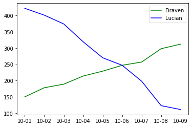
Figure 1: A line plot of the data in Table 1. The x-axis shows the date and the y-axis shows the number of games played for each champion.
Making plots in Python
Data visualization in Python is easy with the Matplotlib library, which includes endless options for creating plots of data. We’ll cover the most useful ones for common data analysis tasks.
Returning to our previous example, the following code generates the line plot in Figure 1 from Table 1:
plt.plot(df['date'], df['DravenFrequency'], color='green', label='Draven')
plt.plot(df['date'], df['LucianFrequency'], color='blue', label='Lucian')
plt.legend()
Variables 'date' and 'frequency' specify the x-axis and y-axis of this plot, respectively. The color and label parameter allow the viewer to distinguish beween the lines by setting the color and assigning a label to each line, as shown in the legend created with 2cm plt.legend().
Adding axis labels and a title
Generally, we want to include axis labels and a title on the plot to make it easier to understand. To do this, add the following commands after the creation of your plot:
plt.ylabel('frequency')
plt.title('Draven and Lucian pick frequency by day')
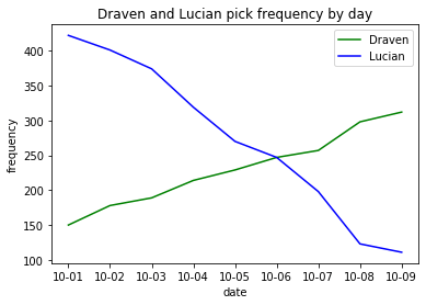
Figure 2: A plot with new labels and a title
Plotting on the secondary y-axis
What should we do if we want to plot two variables whose values fall in very different ranges? For example, in addition to the pick frequency of Lucian each day, suppose we are also interested in the average gold earned each day by Lucian players. As shown in Table 2, these two measurements follow distinctive scales, so it won’t be easy to read if we plot them on the same axis.
| date | LucianFrequency | LucianGoldEarned |
|---|---|---|
| 10-01 | 422 | 11741 |
| 10-02 | 401 | 11572 |
| 10-03 | 374 | 11259 |
| 10-04 | 319 | 11868 |
| 10-05 | 270 | 11440 |
| 10-06 | 247 | 11489 |
| 10-07 | 198 | 11383 |
| 10-08 | 123 | 11359 |
| 10-09 | 111 | 11324 |
Lucian’s pick frequency and gold earned
In these cases, we need to plot one of the variables on a secondary y-axis.
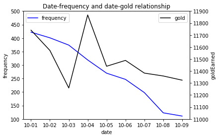
Figure 3: A plot with a secondary y-axis showing gold earned
The full code to make Figure 3 is:
fig,ax1=plt.subplots()
ax2=ax1.twinx()
ax1.plot(df['date'], df['LucianFrequency'], label='frequency', color='blue')
ax2.plot(df['date'], df['LucianGoldEarned'], label='gold', color='black')
ax1.set_ylim([100,500])
ax2.set_ylim([11000,11900])
ax1.set_xlabel('date')
ax1.set_ylabel('frequency')
ax2.set_ylabel('goldEarned')
ax1.legend(loc="upper left")
ax2.legend(loc="upper right")
plt.title('Date-frequency and date-gold relationship')
On the third line, ax2 = ax1.twinx() creates a new y-axis that shares the same x-axis. Just like before, we can then call ax2.plot and other Matplotlib commands on both ax1 and ax2. In this case, those commands set the endpoints for both axes, add labels, and a legend.
Note: Pandas has a command that plots a DataFrame directly, df.plot() which runs Matplotlib behind the scenes. Although it doesn’t have as many customization options as Matplotlib’s full library, plotting in Pandas is often more convenient. For example, with df.plot(), we only need two lines of code to make a plot with a secondary y-axis:
df.plot('date', 'LucianGoldEarned', secondary_y=True, ax=ax1, kind='scatter', color='black')
More plotting options
There are some other useful plotting options such as line thickness, line style (e.g. dotted, dashed), and the size of the plot. The following code uses these options to make more customized plots.
x=[1,2,3]
y1=[1,2,3] # y1 = x
y2=[2,4,6] # y2 = 2x
plt.figure(figsize=(3,3))
plt.plot(x, y1, 'b', label='y1=x', lw=7.0, ls='--')
plt.plot(x, y2, 'k', label='y1=2x')
plt.title('A plot with line width and figure size options enabled')
plt.legend()
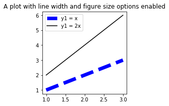
Parameter figsize = (3,3) sets the dimension of the figure to 3 x 3 inches (given as width, height; default is 6.4 x 4.8 inches). Parameter lw = 7.0 changes the thickness of the blue line to 7.0 points and ls = '--' gives us a dotted line.
Data
The datasets needed for the tasks in this chapter are the same as those in the previous chapter. We will need both match_player.csv and match_kills.csv.
Tasks
-
Champion presence table. Using match_player.csv, create a table indicating which champions are present in a match. This should be a match-level table where
each variable represents whether or not a champion was included in the match. If a champion was not in a match, it has a value of 0. Otherwise, if the champion was on team 100, it is marked as 1; if the champion was on
team 200, it is marked as -1. A sample resulting table is given below. You can get this table using the appropriate reshape command. You may also want to check out the Pandas documentation for df.fillna().
matchId Aatrox Ahri ... Zyra 3096587474 1 0 ... -1 . . . . . . . . . . . . . . . - Death map. Using match_kills.csv, plot the location of the kills in match 3362956081 as a scatter plot. The x-axis and y-axis will have a
range from 0 to 15000. You don’t need to include a map of Summoner’s Rift as the background. The map should, however, have the following:
- A descriptive title
- If the killer is on team 100, the dot should be red. If the killer is on team 200, the dot should be blue.
- A square-shaped figure